
Introductory Quilting Course Starts January 22 at Quilty Pleasures in Simi Valley – Call 805-581-1577 to sign up today !

Guila's Art & Other Assorted Joys
Let's make the world more beautiful…together…
Introductory Quilting Course Starts January 22 at Quilty Pleasures in Simi Valley – Call 805-581-1577 to sign up today !
It’s time to get bitten by the Quilt Bug – definitely a LOT more fun than mosquitoes.
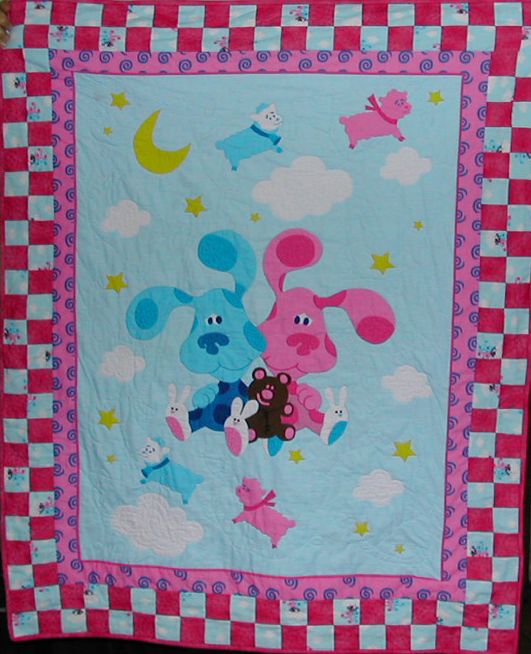
You’ll have a great chance to jump in with our newly scheduled Introduction to Quilting Course to be held at Quilty Pleasures in Simi Valley starting in September. During the series of 6 classes you will learn the skills that you need to make your first quilt.
You will be making a vibrant Autumn (or theme of your choosing) wall quilt 32 inches by 32 inches featuring fabrics that you will choose at the first class meeting.
Here’s a photo of the sample we have prepared.

http://www.quiltypleasures.org
Call Quilty Pleasures to sign up today -805-581-1577
I’ve been busy preparing for what is shaping up to be an exciting Fall schedule of teaching. One of the new workshops planned is to make your own decorative pillow. You will paint your own fabric and embellish it with beads. The class is on the schedule at Baron’s Sewing Center in Woodland Hills for September 24th and October 8th, 2013.
Here is the one that I finished the other day.
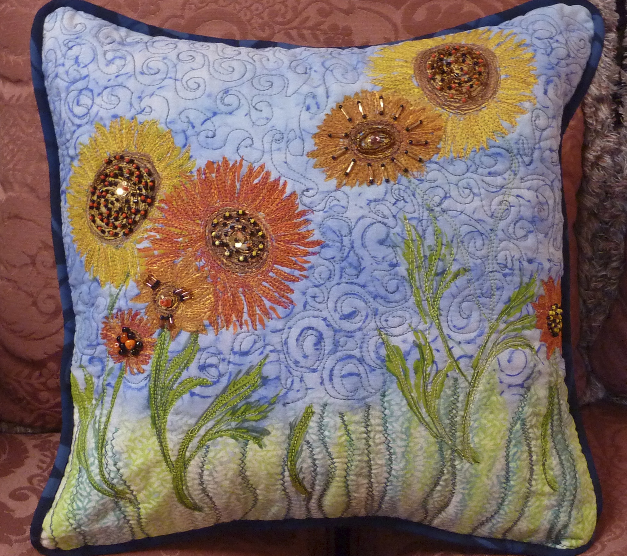
I started with a piece of white PFD Kona cotton and painted the background with an acrylic wash of color. Next I painted the flowers and layered the piece with batting and lining. Then the REAL fun began as I used thread painting to add depth and texture to the design. Here’s where you can really let yourself experiment with color and various thread weights. I particularly liked the look of some variegated 30 wt. thread.
When I declared the thread painting “done” I got out my beads and went to town! Because this will be used for “show and tell” in class I wanted to be sure to incorporate several basic beading stitches. I used moss stitch, scatter stitch, seed stitch, bugle pathways, back stitch and stacked stitch.
My goal was to achieve a vibrant mix of color, texture and bling. Did I achieve it??

One of the most gratifying things as a teacher is that moment when your students’ eyes light up and you can see their creative juices churning.
Well that was a moment repeated many times over the past few weeks as a group of eager sewers and quilters attended our Art Quilt Intro Series.
This was an introductory series of 3 sessions at Baron’s Sewing Center in Woodland Hills. A fourth informal class is planned this week so that the participants can put the final touches on their creations with the instructors on hand for assistance.
Art quilting encompasses a vast number and variety of techniques that are both fun to learn and valuable tools to have when planning a new piece. With limited time available it was a daunting task to select only a few of them. We did so with emphasis on straightforward versatile techniques. We also presented methods that were fun to do and that used products that wouldn’t be too difficult to find. The focus was on technique but each participant was encouraged to put together a piece that would incorporate these newly learned skills.


Session one
We focused on preparing backgrounds; either as a first layer for additional embellishments or to serve as the composition itself.
We introduced a variety of ways to get paint onto your quilt: using fluid acrylic paints and solid oil sticks, the group practiced applications using rubbings, stencils and stamps.
We also discussed and demonstrated Discharge Techniques- various ways of removing color from fabric. These included household bleach and discharge pastes – plain and with color added.
When we got to the “hands on” part of the class, they all took off like a shot – full of enthusiasm and creative ideas It’s unusual to see an entire group just take off and run with their new knowledge the way these women did. We all had a blast.


Session Two
We turned our attention to preparing the quilts for quilting. A very important part occurs before your first stitch and we introduced the topic of thread selection, determining function and style and so on. During this session we also started our discussion of embellishment techniques. We focused on fusible appliqué and methods of securing these design elements. The students also learned how to use foil as a highlighting embellishment – using glue, fusible sheets or a powdered fusible called BoNash to transfer the foil to the fabric surface.
A lot of additional designing went on during the week 2 workshop and both Betsy and I worked closely one on one with the students to help them through their design decisions and implementation.

Session Three
Time to add a little glitz and glamor to our art quilts. We discussed beautiful sparkly Angelina – how to use it, stamp it, apply it to the quilt surface and much more. Wow, exciting stuff to stir up your imagination!


We also talked about and demo’d the use of glitter in your quilt. Talk about your sparkle opportunity.

The little art quilts, well under way, needed to eventually be finished. So we went over various ways to finish the ‘edges’ of the quilts and various methods of applying the ‘false’ back to the quilt.
During these classes the quilting and embellishments were done with the following quilt layers in place: top, stabilizer, batting, muslin. Then, later a more pleasing/interesting fabric backing was added.
We will be putting the final touches on the quilts this next Wednesday morning.
**And we are all looking forward to diving further into the art quilting world this summer. The highly anticipated Art Quilt Camp for Quilters will be held from July 16 through July 20 from 10 AM until 5 PM each day. Sign up now to reserve your spot!


I’ve been using Ink Stamp Pads forever. Remember as kids when you’d get hold of an old stamp and stamp pad and brand everything in sight including the back of your hands?
Many years later I tackled scrap-booking then journaling – again making use of those tempting rubber stamps and lovely inky pads. In those days it was pretty straightforward. If the color called my name I used the pad and didn’t care if it was Dye Ink, Pigment Ink, Solvent, Archival, or whatever.
Now with art quilting there’s more to the selection and more risk in selecting the wrong type of pad. It’s got to transfer cleanly to a very porous surface. And of course you don’t want fading.
You may also be concerned about the image staying put AND crisp and clear after washing or if you’re planning to use wet media over the image. I have NOT included the effects of washing on these samples and will do something on that another time.
Oh I got so confused!!! Everywhere you look – known and trusted online sites/blogs, manufacturers’ sites or craft shop advice sites you get someone else’s opinion. And often these opinions are at odds with one another.
So I decided to take matters into my own hands and go back into my mad scientist mode. I lined up ALL the different types of ink stamp pads that I had on hand, chose a rubber stamp that would print well (not too much detail and deeply carved stamp ridges) on fabric and went to work.
1. I washed, dried and pressed the fabric first: some bleached muslin. (you’ll get a slightly different color cast using the unbleached.)
2. One by one I inked up the stamps, stamped the fabric, and recorded what was used.
3. In a couple of instances I also documented the Surface that I stamped on to see if that made a significant difference. For instance whether it was a hard surface or a cushiony one – including batting.
4. After making sure all impressions were completely dry I pressed with a hot iron.
NOTE: Because I’m going to be using these in Art Quilts I did not wash the fabric again after stamping it. So this is NOT a test for washability, simply a comparison of how well the inks did visually on the fabric. I was looking for vibrancy, clarity and crisp edges.
Here are the photos of my first go-round.


In my opinion the best performers were the dye inks from the Recollections and Memento (Tsukineko) lines. I stamped with Recollections with and without batting under the muslin and definitely got a crisper edge without the batting.
I also was pleased with the Dye Ink in the Distress Ink Line from Ranger. (That’s the one in the group to the LEFT in the upper left hand corner.)
The solvent ink from Staz-on and Archival Dye Ink from Ranger were both excellent. The downside with both is that they are limited in color choice and are quite pricey.
The pigment ink from Colorbox left a smudgy outline. I tried it on a lightly padded surface, over batting and on a hard surface. The hard surface was best but still not as distinct as the Dye Inks.
The pigment ink from Versacraft was acceptable but not as crisp as Memento.
*A note about Versacraft: it is widely accepted as a good choice for fabric stamping as it has proven to stay put after washing. So if that’s your need it’s definitely a consideration.
Further test:
I further tested the Dye Ink from Recollections with a larger stamp to see if I could repeat the good outcome. I am partial to this particular pad because of availability and lower cost. However I haven’t seen it in a wide array of colors.

I retested the Memento as well. Both were excellent. Memento has a broad choice of colors available. It’s a little pricey in the larger stamp pad but is available in a smaller more economical Dew Drop size.

And here is the Dye Ink from Ranger (Distress Ink) This comes in a wonderful array of colors.
")
Next I will be testing my collection of brush markers with stamps to see how they perform on fabric so stay tuned.
Please pretty please leave me a comment – especially if you have had experience with any of these and would like to add your observations. That would be grand and thank you!!
Please excuse if you see this more than once. I’ve cross posted it to the Quilt Art list and on my Facebook page as well.
I have a logistics/design issue that I’ve been working on and am not happy with my solutions so far.
I’m SURE there must be one or more of you out there who has happily solved this.
I have more than a dozen small quilts that vary in size with the largest about 12 x 12.
They do not have a cohesive theme of any kind.
I would like to put them all into book form for viewing – but want it to be fairly easy to remove them and of course not damage them in any way. I do not want to put them into ‘jackets’.
I have looked at several tutorials and patterns and everything I see is related to making a cover for an existing journal or sewing/quilting a journal. Some of these are extraordinarily beautiful but not what I need.
Ideas???
Thank you!!
 Well, this is primarily a visual arts blog so I’d better do a quick entry and bring you up to date with what’s on my wall. The nice thing about having so many pieces in progress is that I have a variety of styles to work on and will never ever get bored. The bad thing about having so many pieces unfinished is having so many pieces unfinished.
I started this awhile back and am in the midst of quilting it. Almost there! I based it on the Hollow Box block by Sara Nephew then designed the overall quilt. Not sure if this would qualify as an art quilt. I’d probably call it a contemporary quilt if pressed to pigeonhole it.
What would you call it?


 Going Around in All The Best Circles
Original Design based on the traditional Drunkard’s Path Block. This quilt was juried into the Pacific International Quilt Festival in 2008.


A friend asked me to approximate how much time I spend in a week on working on my art. This is a little different twist on the question: how long did that take you? It was a question that I was very interested in answering and did it ever open my eyes!!
So, especially you my poet and artist friends – what would you add to this list?
Do you think that it is important or even desirable to stick to acknowledged forms in poetry or other art?
I’m very interested in your comments.
