Art, Art Quilt, Fiber Art, Hand Dyed Fabric, Quilts

The Value of Value

Late last year I was VERY fortunate to notice that an online class was scheduled to begin in January that seemed perfect and timely for my resolution to improve my work in 2016.

One of my most admired art quilters is teaching it (Elizabeth Barton) and the Class Title:  A Master Class in Design for Art Quilters – speaks directly to my own need to ‘polish’ my design skills and to explore alternatives.  

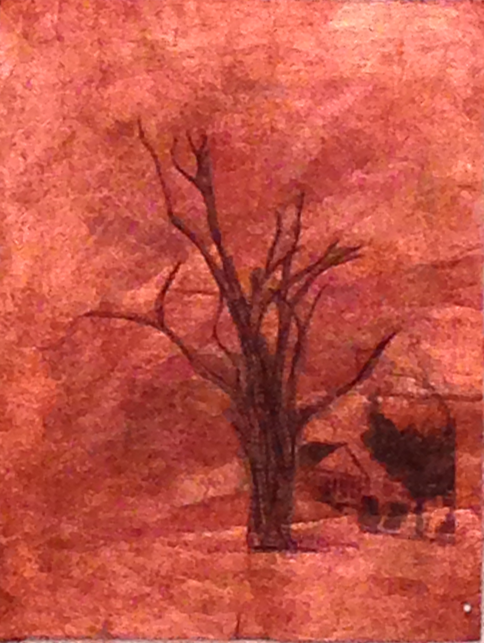
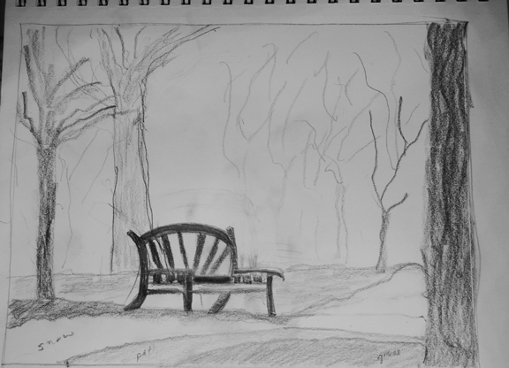
We are delving into a different design concept each month and in January, Elizabeth had us take a fresh look at our use of value.   After presenting a couple of possible designs to work with I settled on the following sketch – a sketch that I based on a photograph that I took after a snowfall in Minnehaha Park, Minneapolis.

JAN GG Sketch 2

My next step was to gather fabric for possible use in this quilt.  The instruction was to use a range of at least 5  values of the same color – preferably a color that included an intense dark value such as black or brown or even navy blue.   I selected black, various grays and white.  I also wanted there to be added interest with texture.  Linen helped with that as did some thread work added later.

P1000078

Some of the fabrics that I made available for this quilt are shown above.  I used dark to light gray cotton threads for stitching plus one variegated thread to thread paint a tree trunk and add texture.  I included several of my hand dyed fabrics to the mix.

I ‘cleaned up’ my sketch, enlarged it to actual size, printed it out and created my templates.

In choosing my values for color placement I had to pay attention to how the color value would affect perception of depth and distance.  I also wanted to maintain the lonely, slightly haunted mood of the original photo.   AND to keep the overall image simple and uncomplicated.

JAN GG FIN

My teacher’s critique immediately pointed out my wobbly bench and I plan to correct that. I also plan to add more fine branches to the background and am going to include some hand stitched branches to the mix.

I think this has turned out to be a great example of how color both interprets and projects mood so vividly!   I am tempted to do this same scene, at some point, outfitted in its mid summer finery.

Art, Art Quilt, Fiber Art, Mixed Media, Quilts, works in process

Work (still) in Progress

There are lots of reasons we don’t finish our projects right away.  And one of them is that we’re not quite sure how we WANT to complete the piece.

So this has been hanging around for awhile now on my design wall.

tree on aura_edited-1

This started as a plain piece of Lutradur.  I took a photo of a tree on my street and worked with it using Photoshop Elements.  I took out everything that I didn’t want in my finished piece including all the leaves on the tree.  This step also included removing all the color.

In the meantime I painted the Lutradur with acrylic paints.  I used some from Golden paint and some Lumiere in various coppery hues.

Then the moment of truth as I printed my tree onto the Lutradur.

Then lots of fun to thread paint the tree itself.  I used a variegated 40 weight cotton from King Tut – (In the meantime I had layered the piece with cotton batting.

and that’s when I stopped.

The biggest question in my mind is whether or not to add quilting.

So now it’s time to finish and I’ve given myself 2 weeks to do that.  I hope by posting the process to date I’ll have more accountability to do that – to keep it as a priority.

What’s your opinion on adding more quilting to the piece?

Accessories and Ornaments, Art, Home Dec

Paint and Bead Your Own Decorative Pillow ! Back By Demand Jan. 14, 2014

I’ve been busy preparing for what is shaping up to be an exciting Fall schedule of teaching.  One of the new workshops planned is to make your own decorative pillow.  You will paint your own fabric and embellish it with beads.  The class is on the schedule at Baron’s Sewing Center in Woodland Hills for September 24th and October 8th, 2013.

Here is the one that I finished the other day.

P1040166

I started with a piece of white PFD Kona cotton and painted the background with an acrylic wash of color.  Next I painted the flowers and layered the piece with batting and lining.  Then the REAL fun began as I used thread painting to add depth and texture to the design.  Here’s where you can really let yourself experiment with color and various thread weights.  I particularly liked the look of some variegated 30 wt. thread. 

When I declared the thread painting “done” I got out my beads and went to town!  Because this will be used for “show and tell” in class I wanted to be sure to incorporate several basic beading stitches.  I used moss stitch, scatter stitch, seed stitch, bugle pathways, back stitch and stacked stitch.  

My goal was to achieve a vibrant mix of color, texture and bling.  Did I achieve it??