Fiber Art, Tutorials

Demystifying Stamp Pads

 I’ve been using Ink Stamp Pads forever. Remember as kids when you’d get hold of an old stamp and stamp pad and brand everything in sight including the back of your hands?

Many years later I tackled scrap-booking then journaling – again making use of those tempting rubber stamps and lovely inky pads. In those days it was pretty straightforward. If the color called my name I used the pad and didn’t care if it was Dye Ink, Pigment Ink, Solvent, Archival, or whatever.

Now with art quilting there’s more to the selection and more risk in selecting the wrong type of pad. It’s got to transfer cleanly to a very porous surface. And of course you don’t want fading.

You may also be concerned about the image staying put AND crisp and clear after washing or if you’re planning to use wet media over the image. I have NOT included the effects of washing on these samples and will do something on that another time.

Oh I got so confused!!!  Everywhere you look – known and trusted online sites/blogs, manufacturers’ sites or craft shop advice sites you get someone else’s opinion. And often these opinions are at odds with one another.

So I decided to take matters into my own hands and go back into my mad scientist mode. I lined up ALL the different types of ink stamp pads that I had on hand, chose a rubber stamp that would print well (not too much detail and deeply carved stamp ridges) on fabric and went to work.

1. I washed, dried and pressed the fabric first: some bleached muslin. (you’ll get a slightly different color cast using the unbleached.)

2. One by one I inked up the stamps, stamped the fabric, and recorded what was used.

3. In a couple of instances I also documented the Surface that I stamped on to see if that made a significant difference. For instance whether it was a hard surface or a cushiony one – including batting.

4. After making sure all impressions were completely dry I pressed with a hot iron.

NOTE: Because I’m going to be using these in Art Quilts I did not wash the fabric again after stamping it. So this is NOT a test for washability, simply a comparison of how well the inks did visually on the fabric. I was looking for vibrancy, clarity and crisp edges.

Here are the photos of my first go-round.
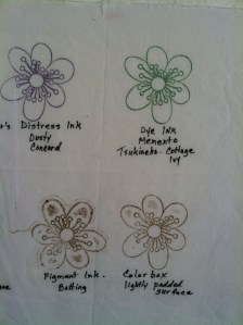


                  In my opinion the best performers were the dye inks from the Recollections and Memento (Tsukineko) lines. I stamped with Recollections with and without batting under the muslin and definitely got a crisper edge without the batting.

I also was pleased with the Dye Ink in the Distress Ink Line from Ranger. (That’s the one in the group to the LEFT in the upper left hand corner.)

The solvent ink from Staz-on and Archival Dye Ink from Ranger were both excellent. The downside with both is that they are limited in color choice and are quite pricey.

The pigment ink from Colorbox left a smudgy outline. I tried it on a lightly padded surface, over batting and on a hard surface. The hard surface was best but still not as distinct as the Dye Inks.

The pigment ink from Versacraft was acceptable but not as crisp as Memento.

*A note about Versacraft: it is widely accepted as a good choice for fabric stamping as it has proven to stay put after washing. So if that’s your need it’s definitely a consideration.

Further test:

I further tested the Dye Ink from Recollections with a larger stamp to see if I could repeat the good outcome. I am partial to this particular pad because of availability and lower cost. However I haven’t seen it in a wide array of colors.

I retested the Memento as well. Both were excellent. Memento has a broad choice of colors available. It’s a little pricey in the larger stamp pad but is available in a smaller more economical Dew Drop size.

And here is the Dye Ink from Ranger (Distress Ink) This comes in a wonderful array of colors.

Next I will be testing my collection of brush markers with stamps to see how they perform on fabric so stay tuned.

Please pretty please leave me a comment – especially if you have had experience with any of these and would like to add your observations. That would be grand and thank you!!

Art, Haiku, Mixed Media, Poetry, Poetry and Photography

Phases of the Moon

The prompt word for February’s Haiku Art Challenge was “Moon.”  I thought of all the different sayings that we have to describe the moon: some quite descriptive, others turned into common expressions and a few quite fanciful.  So much folklore and romance has evolved from our common experience of viewing this orb in the night sky. called

  Blue Moon, Green Cheese Moon and Harvest Moon
Chameleon moon
many faces to delight
changing yet constant
Phases of the Moon
Phases of the Moon
 
Art, Art Quilt, Art Quilts, Fiber Art, Haiku, Poetry, Poetry and Photography

Challenge for January: Exhilaration – Haiku and Art

The Haiku Art  prompt word for January was Exhilaration.
The American Heritage Dictionary defines “Exhilaration” as    “The state of being stimulated, refreshed, or elated.”
Sometimes all it takes to experience these feelings is to step outside on a sunny day.
The Haiku
scent of new mown grass
sunbeam caresses my cheek
living…feeling…aaaaah…
For the art work that I was preparing to go with this haiku – I didn’t want to be too structured.  I wanted to indicate an almost childlike feeling of exhilaration with my composition and color choices.
At the same time, as a developing art quilter, I wanted to incorporate a couple of new techniques and see “what if”?
First off I used a “blah” pastel print in lieu of plain muslin as my base. I didn’t mind that it partly “showed through” – just felt it added some interest.
I felt that color was of first importance in this piece – so before doing anything else I painted my background using acrylic paint.  In order to add some texture to the piece I used some Golden Light Molding Paste to parts of the grassy area.    
I quilted the piece extensively with heavy thread. 
Art

A is for Art (what makes it art?)

 I have an old dear friend who blogs regularly and did a series last year that was prompted by the alphabet. I thought then that it would be fun to try.  (Thank you Marallyn! )   And it just so happens that “A” is perfect for something that I’ve been wanting to talk about here.

Last semester my husband showed a video to his Biological Anthropology class that portrayed a chimp painting.  The chimp seemed to be enjoying the process and he made some colorful pictures.  They weren’t representative of anything in particular – just colorful blobs of paint.

One of the students raised a question:  Was the work that the chimp produced “Art”? Why do you think it might be?  If you don’t think so, why not?

This remains a hotly debated topic in today’s Anthropological, Philosophical and Art circles.


Art Quilt, Art Quilts, Fiber Art, Mixed Media, Quilts

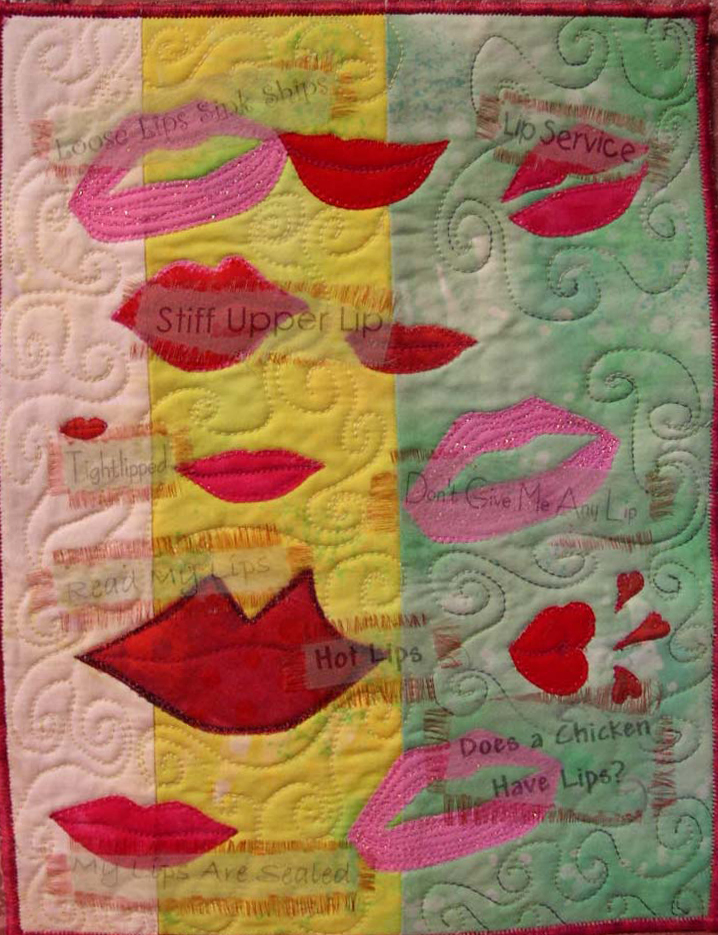
I’ve Got Lips – Art Quilt using Extravorganza

I love doing these journal quilts – what a wonderful way to try new techniques. For “I’ve Got Lips” above I first did a pieced background and quilted it. Then I drew and cut out appliques of various “lips” – with a variety of pink and red fabrics. (I had to add paint to get the right color a couple of times) I looked for as many “lip” quotes as I could find and printed them out in various fonts using ExtravOrganza in my inkjet printer. I then cut out the sayings, frayed the edges and painted each one using a fabric marker. I adhered them to the quilt with a clear fabric glue.
Lips Detail
Art, Poetry, Poetry and Photography

Reflections on Poetry and Art

Two things came up today that led me to thinking about the why and the how of what I do. I started posting some poetry to an art group called Mind’s Eye and a comment prompted me to dig in and think about why I write – especially because poetry isn’t my primary identification as an artist.  The comment mentioned how “to the point” the piece was and how most people could identify with it.  Here’s what I wrote:
…I write (as a lot of us do), to help clarify my thoughts and feelings and with the expectation that if can get the feelings translated into words that they (the feelings) will be somewhat mitigated.  While writing I create my own form as I go.  I’m not familiar enough with contemporary poetry to know what the “established” or common styles are or if I come close to any of them.  I really don’t care.  I do care that people will be able to relate to what I have written.  If an obscure reference happens to be perfect to include in my narrative then I will include it.  But not if it creates a roadblock for most readers. It is important to me that my work be to the point and accessible

A friend asked me to approximate how much time I spend in a week on working on my art.  This is a little different twist on the question:  how long did that take you?  It was a question that I was very interested in answering and did it ever open my eyes!!

Hard to say….. I spend many hours day, evening, night working on things related to my art: working on websites, adding items to Etsy, photographing what I see around me for inspiration, photographing quilts and items for website etc., reading about new techniques, looking at other artists’ work for inspiration, writing my poetry (that often leads to an art piece), shopping for supplies, writing in my journal (really unleashes the creativity), selecting fabric and supplies for a new project, daydreaming about the new project, sketching it out, cutting, painting, drawing, fusing, stitching, solving problems, quilting, adding hanging sleeves, hand stitching bindings, hand applying beads, hand embroidery. And so on. You get the picture!!

So, especially you my poet and artist friends – what would you add to this list?

Do you think that it is important or even desirable to stick to acknowledged forms in poetry or other art? 

I’m very interested in your comments.